Nidhi Jewellers - Logo & Branding

Nidhi Jewellers - Logo & Branding

Logo design - brief, development & articulation

       This project involved designing the logo, and branding for a private jewellery firm based out of Mysore district, Karnataka. Their requirement was for a logo which would have an ethnic connection and yet sophisticated enough to appeal to the younger tech savvy generation. Also the logo should be versatile enough to be used in multiple formats and print mediums.

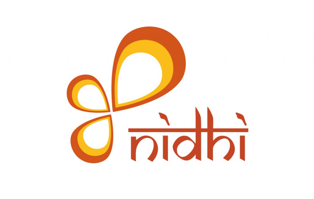
       The word “Nidhi” originally derived from Sanskrit – literally translates to ‘wealth’ in most indian languages and incidentally was also the name of the client’s daughter. So the client wanted to take it further and formulate the entire branding around it.

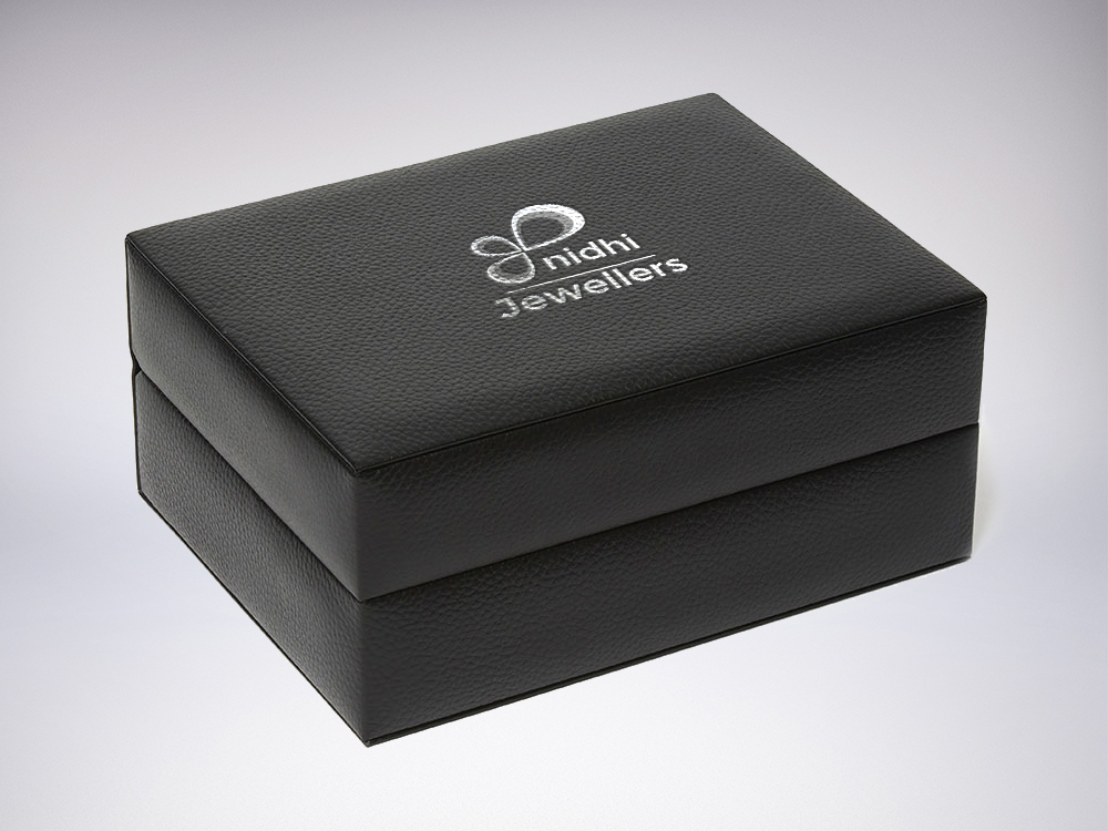
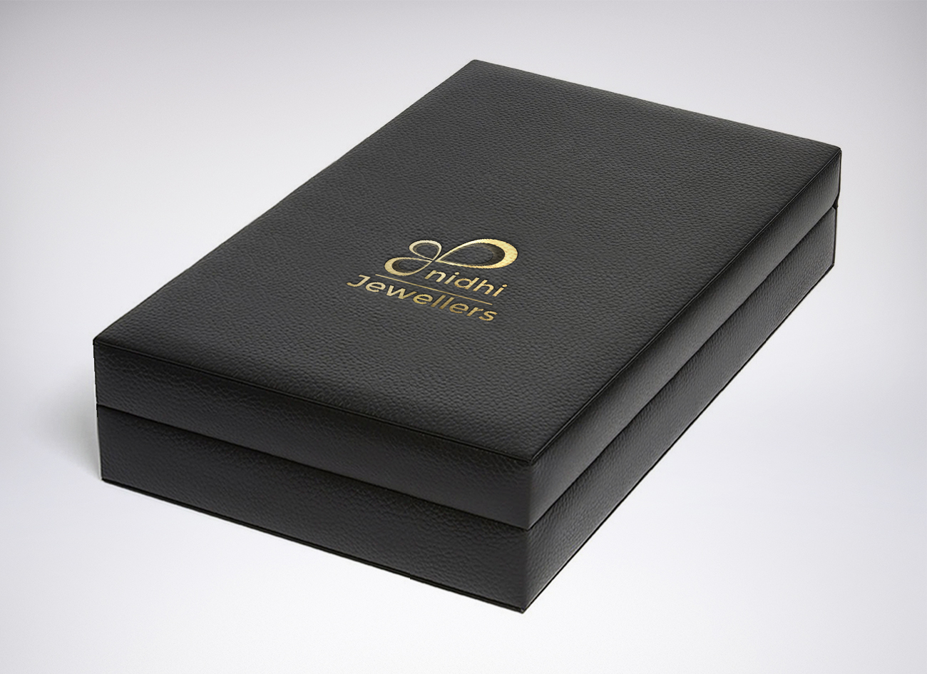
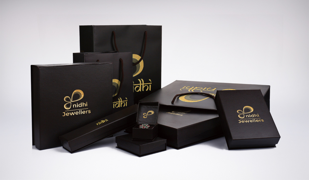
        The primary logo form is based on the droplet shape – ‘bhindu’ arranged in a flowery pattern. Three bhindu’s are used representing gold, silver and gems – all forms of wealth, dear to us. Also the color theme was chosen to represent Vermilion, Turmeric indicating connection to the Indian heritage and cultural psyche.   

       Moreover since the primary usage of the logo would be on the Jewellery box, other packaging denoting the brand; gold & silver foil leterring version of the logo was also designed.

     These would be used to stamp or letterpress on leather, faux leather, or dark background materials to provide a classy exquisite look.   

Alternative Language Representations

Visualization of Logo